In order to create the animation I want, I am going to do my best to combine many different types of animation and styles from UPA and Hirschfeld to 3D and Disney and everywhere in between. Let's hope it works out.
One of the crucial methods I'm trying my hand at is to blend 3D and 2D animation to the point where it's almost indistinguishable. I've been researching this sort of animation like crazy and am itching to do it.
Some of the main blogs I have gotten inspiration from are the wonderful animation Keith Lango (thank you Garguilo for showing him to me) and also one of his students Sunny Kharbanda and their blogs http://keithlango.blogspot.com/ and http://sunnykharbanda.com/blog/ respectively. Check those guys out.
I started off reading Keith's blog and his awesome work with his character Otto. He created a way to squiggle a line to keep the action going and make it look similar to older, looser animation types.
How cool does that simple test look?! Awesome.
He did lots with that and led me to Sunny's blog where he was working on creating amazing non-photo realistic texturing. Now this may be getting technical for some but basically the man wanted his 3D stuff to NOT look like 3D and more like it was painted or something like that.
Here are some little videos he did.
You can see how painterly and greatly those first couple of animations look (not the flour sack one, that one IS 2D). So I'm trying to base some of my work off of tutorials both of these great animators have put out there and it looks really cool.
A quick test I did with one of my old animations and the squiggle toon like is here.
So there you have it. Some of my crazy and lofty ideas of combining a million styles of animation into one little short film. Phewee.
Ok so it's been a while since I've updated but ya know... such is life.
So onto more inspiration for my senior film. Aside from the amazing line work I showed before, the artwork and style of UPA studios is without a doubt some of my favorite work in any art media. I love it. I cannot get enough of the stuff. And I just love how simplistic and it yet it is brilliant and tells you just what you need to know.
Some of the photos I used as inspiration for my backgrounds were just some shots from their old shorts.
So simple! Yet you know it's a kitchen.
Great negative space...
As you can see, the crew was a master at minimalism and line work as well.
As far as characters go... that's a bit more tricky. At this point in time I have some characters drawn out, modeled and textured but I'm not sure if I'm happy with them. So they are likely to change. But either way, here are some great characters from UPA.
There's like 10 lines here. And it's amazing.
Again, just a few simple shapes is all they make.
So you can see how they really incorporated minimalism in all aspects of their animations. And that's what I'm really going to try and do in my animation. It's just so fun and simple. Animation doesn't have to be crazy looking to be great.
So let's start off with some inspiration. You know the jist of my story but I'll tell you how I've come to my decision on how to design it. This is just the start of my inspiration posts. As I have much to draw from.
Probably one of my favorite animations of all time is in Fantasia 2000 and is to the lovely sounds of Rhapsody in Blue by Gershwin. Amazing piece and truly expressive. And the team over at Disney at the time seemed to think the same thing. They created an amazing view of a day in the life of several different people living in NYC in the Great Depression. The artwork and long flowy lines are amazing and the dynamic shapes the characters form is fantastic.
I really loved the way that the music meshed with the movements of the characters on film and am actually trying to incorporate that somehow into my film. I like the music accenting and telling the story instead of just plain words. Music has so much to offer.
But anyways as you can see, simply awesome stuff there.
And most of THAT work was inspired by a guy named Al Hirshfeld. That's where they decided on the long flowing and curvy lines for the characters.
Look at that use of line!
So the man has some talent. Clearly.
What I drew from him is the use of line and how important that is and how much it contributes to the scene. It's brilliant.
Ok so this is a rough initial post in my senior film blog that I created a while ago.
I want to do this to keep myself motivated and continuously working on stuff. I'll try and post as much as I can as often as I can. So try and check it out whenever you are bored out of your mind and want to see what I've been up to.
I'm going to be posting stuff I've already done for the first few posts in order to spread it out and keep things organized in my posts. And for the sake of reading as well.
But to keep this initial post short and sweet, I'll give you a little overview of my film.
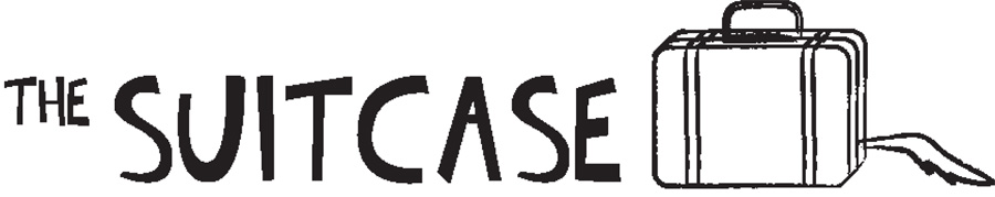
It's called "The Suitcase" (hence the blog title) and is about a girl dealing with a bad situation involving a dead dog and little to no help. That's the short story. HA. Sounds great right. Riveting if you will?
But it's going to be swell. An ode to older styles of animation in the animation styling and also the aesthetic styling. While the animation will be done in 3D, the final output will be made to resemble tradition styles of animation. From the exaggerated movements, to the squiggly lines, to the simplified backgrounds. It's all in there and meant to create a fantastic and colorful world for my main character to run around in.
I think it's going to really freaking cool and I'm excited about it, if not also a bit scared. We'll see.